
Hey, I'm Skylar
〰️
Product Designer
〰️
Hey, I'm Skylar 〰️ Product Designer 〰️
Former filmmaker, current product designer, forever storyteller.
Currently shaping the future of construction workflows at Bluebeam. Previously brought clarity to complex data at Walmart.
I use my strong sense of empathy to design digital experiences that empower users to complete complex tasks.
My philosophies for designing expert user tools
Flexibility First
What it means
Expert users need freedom. Their workflows are rarely linear, and their habits are shaped by years of practice and context. Prescriptive design often gets in the way.
How it shows up in my work
I avoid heavy-handed guardrails that force a single “correct” path. Instead, I design systems that allow exploration, including the possibility of error. For experts, errors are not failures—they’re often learning signals, shortcuts, or intentional deviations.
The principle
Design for adaptability, not rigidity. Trust the user to bring expertise; give them the space to use it.
Optimize for Momentum
What it means
For expert users, momentum is everything. Once they’re in flow, interruptions or slowdowns feel disproportionately frustrating. The best tools don’t just enable tasks—they sustain momentum by minimizing friction and keeping the pace of work steady.
How it shows up in my work
I design with an eye toward efficiency at scale: supporting keyboard shortcuts, bulk actions, and customization that keeps users moving. It’s not just about raw speed, but about preserving rhythm—helping experts stay in flow so their focus stays on the work, not the tool.
The principle
Momentum is productivity. Design to keep users moving forward without unnecessary friction.
Stay in Context
What it means
Expert users work best when the tool adapts to their moment, not the other way around. Pulling them out of their flow—whether through detached menus, modal interruptions, or context shifts—creates unnecessary friction and slows decision-making.
How it shows up in my work
I design interactions so that the work stays central. Menus, options, and supporting tools appear where the user already is, reducing the need to navigate away or reorient themselves. New experiences are introduced in-line, so users remain anchored in their task rather than forced into a separate environment.
The principle
Keep users grounded. Design so that actions, menus, and workflows move with them, not against them.
Some of my recent projects
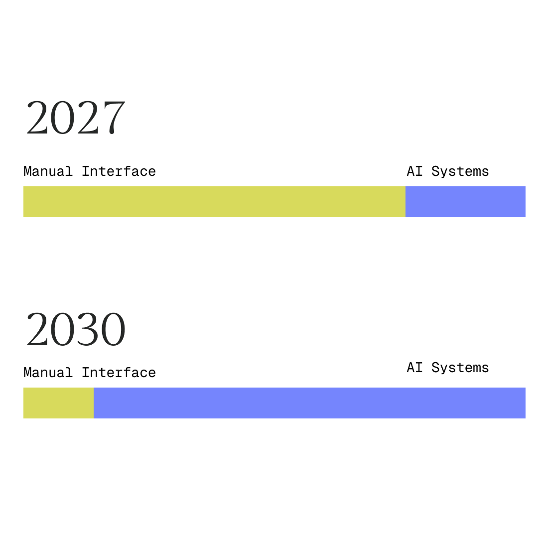
Introducing AI as a system layer—helping construction professionals transition from manual tools to AI-assisted and eventually agentic workflows.
Defining the ✨North Star✨ Vision for AI at Bluebeam
AI
Systems Thinking
Modernizing Legacy
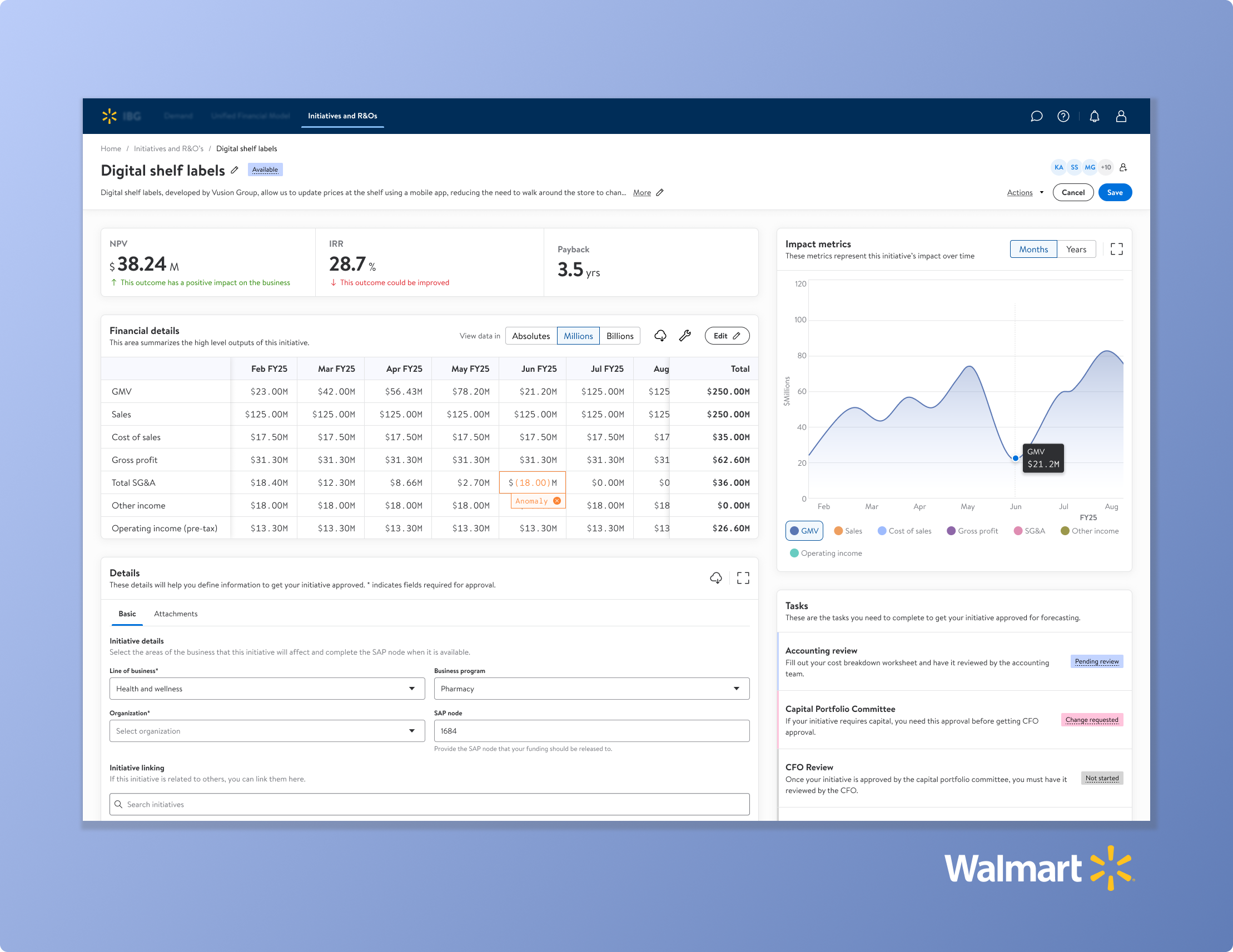
Walmart financial planning & analysis
Increasing user adoption with a smarter, friendlier portfolio management dashboard.
Design strategy
E2E Design
User Research
Maintaining Momentum in Expert Workflows with Offset
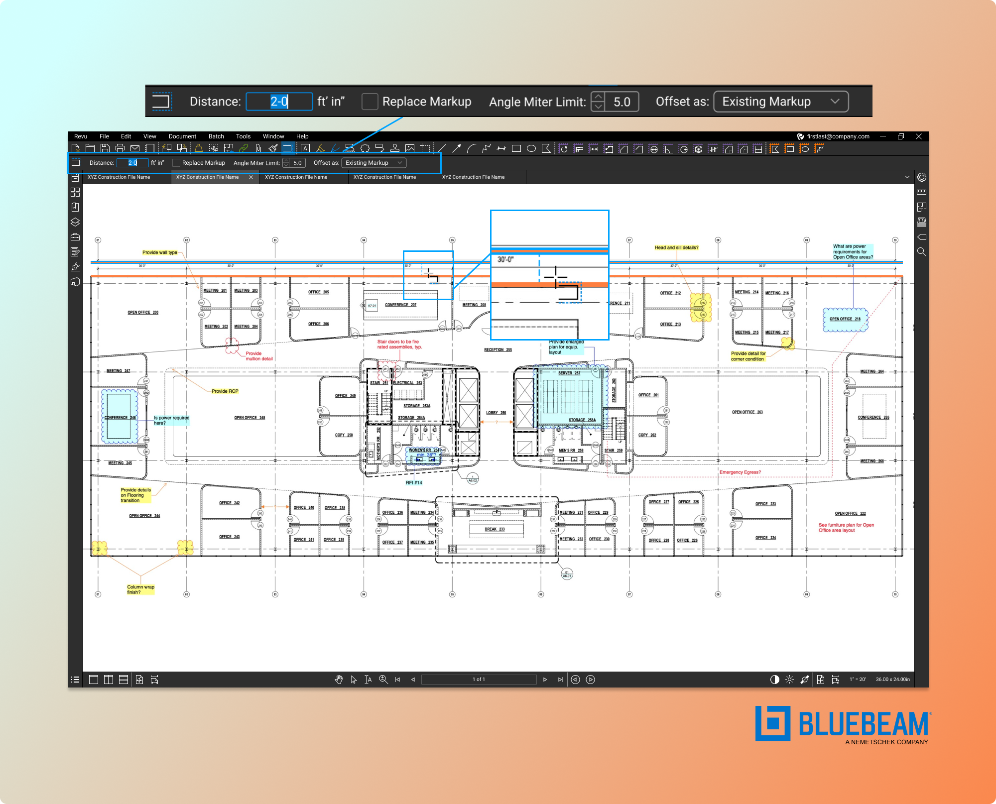
Designing Bluebeam Revu’s Offset tool through research and cross-disciplinary collaboration to support expert construction workflows.
E2E Design
Expert Workflows
User Research
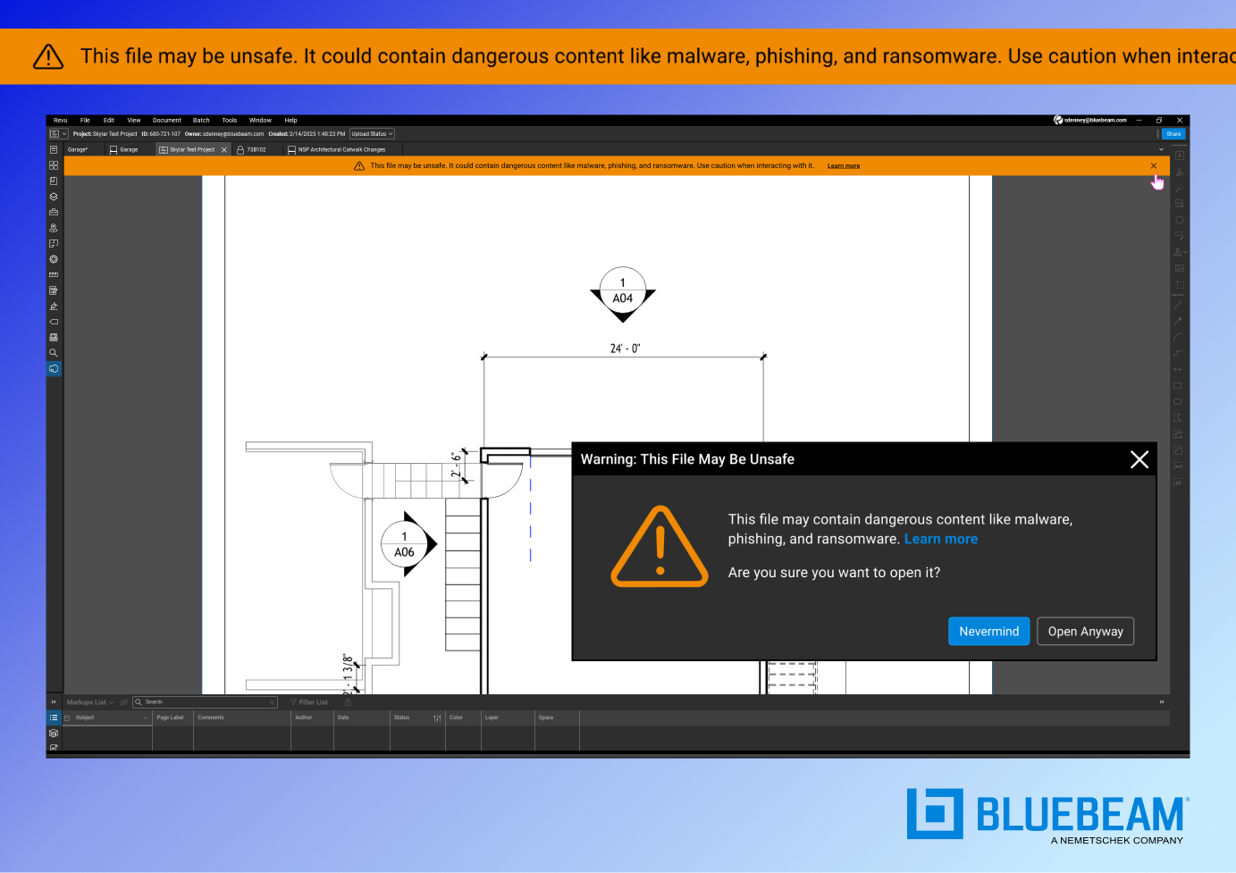
Transforming a technical, high-stakes process into an intuitive experience that supports confident decision-making.
Simplifying Threat Detection in High-Risk Environments
Product Strategy
Compliance
Security UX

Walmart design system component
Increasing design efficiency and UI consistency by building a component for use across an AI-driven finance tool.
System Design
UI Design

Reading tree mobile app
Using virtual reality to maintain the magical experience of book fairs for underserved communities amidst COVID.
User research
UX Design
UI Design

Walmart customer data management
Helping marketing professionals search and filter vast collections of customer data to increase efficiency.
Interaction design
Visual design